Website re-design: we need your input!

A few months ago, the Board decided to start a re-design of the fsharp.org website. fsharp.org is one of the first sites newcomers looking for F# resources will find, and it is therefore crucial to make a good first impression.

Over the years, fsharp.org has grown organically, which resulted in some issues: finding resources is difficult, the content is overwhelming, joining is confusing, it is hard for the Community to contribute fixes, and the overall message is not clear.

While many people visit fsharp.org, we believe our main audience is:

  • developers who are F# curious and want to get started,
  • C-level managers (CTOs) evaluating F# adoption.

Goals:
1 improve overall looks,
2 improve navigation and content organization,
3 improve maintainability,
4 improve registration/login experience,
5 incorporate a new version of TryFSharp (F# editor in the browser).

The re-design effort is happening, along 2 directions. A design firm has been working on 1 and 2, and a separate effort is taking place for the back-end part (3, 4, 5).

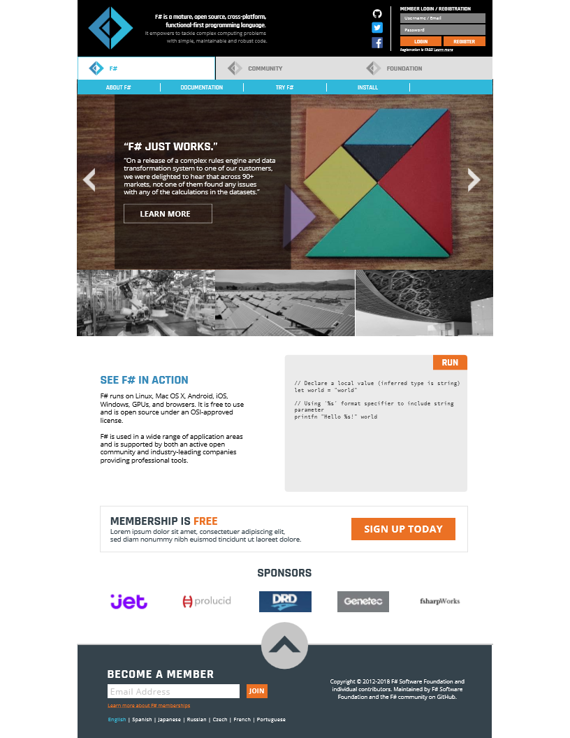
What you will find below is the current proposal from the design firm. The main changes are:

  • organization in 3 sections (F#/main, Community, Foundation)
  • simplification of navigation, with less content, better maintained and easier to find,
  • focus on a few case studies / testimonials on the front page
  • TryFSharp / live editor on the front page

The documents attached show:

  • 2 views of the home page, each highlighting a different case study / testimonial
  • the navigation menu for the 3 sections (F#/main, Community, Foundation).

Main page, version 1

Main page, version 2

Menus

Link to higher definition pdf document

We think this direction is a clear overall improvement over the current situation.

We would love to hear your feedback, to make sure we get this right!

One of the reasons we decided to work with a design firm is that, well, while most of us are software engineers, their specific expertise is on design and user experience. In that frame, we are particularly interested in feedback that helps them understand what we want to convey, and what might be missing, and less how to specifically fix it.

What we specifically would like feedback on:

  • index/main page organization
  • will it grow well over time?
  • look and feel, general impressions
  • is there anything missing from the current website?
  • color, graphics, …
  • does this raise any concerns?
  • what would a / your CTO think?
  • what would you / your friend think?

What is not in scope:

  • we will have some feedback later on around back-end improvements, and the new version of TryFSharp
  • the contents of the pages will be fleshed out later

So… let us know what you think, and how we can make this better!

4 Likes

Hi,

Let me start by saying sorry, because my critic might be a bit harsh
While I strongly appreciate the effort, it is clear this is function over form

I dont see much improvement from the current design
The new proposed design is with all honesty, boring, unimaginative and uninspiring
it is very traditional and basic, it looks like dozen of other site that sell generic products

F#, is usually touted as a more modern, more advanced, more academic, more scientific language compared to other

People using F#, are choosing a radical change, not an incremental change
A new website I hope would and should reflect F# image that it have, or that we wish to have

Now compare this to other sites
https://golang.org/
This is a lot cleaner than what you are proposing, and it cute and fun … and easy on the eye
fun and easy … two qualities of Go I would say
And it doesnt look like it came out of standard template

https://www.rust-lang.org/en-US/
I am not a fan, this site doesnt do rust justice, but i like the fork on github link and now that microsoft owns github, even more reason to have this bit

https://www.gnu.org/software/guile/
Now this is different, this is a site that have a story to tell about the language
I want to learn guile just as a tribute for this site

https://racket-lang.org/
Now I look at this site, and all i think of, this is science, this must be so advanced

We can probably analyze more example
but … the bottom line for me, the new design is an incremental enhancement, i would rather have a radical one, that really sell F# for what it is … a modern pragmatic language

7 Likes

The new design is fine and better than the style of the languages in @system 's list in my opinion.

The structure is too complex.
F# / Community / Foundation
About / Programs / Working Groups / Diversity / Membership
I assume this a tree structure showing what happens when Foundation is selected.

If you are going to have two layers like this I would have

  • F#
    • About
    • Resources
    • Community
  • Foundation
    • About
    • Programs (including working groups and diversity)
    • Membership

But it’s still more complicated than most visitors will be able to deal with, and reducing to one layer would be much better:

  • About F#
  • Resources (including community)
  • Foundation
2 Likes

I think we should put up front features/advantages of F#. It may be possible to make something that works for developers and managers. Maybe group as follows, with code examples or pics:

Productivity: Intellisense, type inference, concision, cleanness
Bug-free code: type safety, no nulls
Cross-platform: NB order platforms by importance or alphabetical or something more structured (desktop (windows, mac os), mobile (android, ios), server (linux, windows). Avoid any hint of fanaticism here.
Ecosystem: .Net compatibility, range of libraries. (Could put open source emphasis here.)
Performance: JIT or machine code compilation

3 Likes

Can you try changing the black header to white , and of course change the font colors to blue or orange

I think this small change, will help make the site look more original, and less coporate-ty

2 Likes

The banner and menus seem okay, though I like @systems suggestion about lightening it up.

It seems very visually busy to me, and puts me more in the mood of C# than F#.

If a CTO or curious dev hits the site, they should be given the immediate message that it is worth sticking around and learning more.

Like @charlesroddie suggests, advertising features and advantages provides a hook that I believe the site needs. It would give the intended audience that immediate message.

Personally, I don’t see slogans, testimonials, and large pictures keeping CTO’s and new devs on the site. F# is not an enterprise solution or a kitchen appliance.

5 Likes

My prospective of advise is someone who has used open source, not .net languages all my working life, trying to get into F#, so I understand there can be some things I’m not understanding about this site, I certainly don’t know fsharp.org very well, I came here from twitter

Please have a look at the home pages of the following languages/frameworks:

  • ReasonML
  • Reason React (also has a blue theme)
  • ReactJS
  • Elm
  • microsoft dot com/net/learn/languages/fsharp

Here’s my recommendations:

  • Move login into it’s own page
  • Remove the slider
  • Move social media into the footer
  • Split github into its own menu item
  • Search?
  • Move the register form into another page
  • Code example needs to be above the fold and shows off a feature that is exceptional in F# compared to a Java like language, ReasonML used union types and pattern matching to demonstrate the language’s value, microsoft’s learn f sharp site does this quite well
  • I don’t know the difference between foundation/community/F# is the foundation not the community? To have that divide is worrying from the prospective of someone who uses open source, either way those sub menus could do with their own dedicated page under community
  • I’d stick with white and blue, not white, orange, black and blue
  • Remove the long text next to the main logo, it should just have logo, Title (F#), navigation on one line
  • No Sub menus, the top level links take you to new pages
  • Add two buttons, try it, getting started where the slider was
  • Be specific what F# language features stand out, do not say nebulous things like “F# is used in a wide range of application areas”
  • Remove the call to sign up in the middle of the page
  • Add company logos at the bottom of trusted companies that use F# in production
  • Do not mention in the footer the “F# Software Foundation and the F# community” it’s not us and the peons
  • Ease up the use of the F# logo, once is enough, it’s not particularly attractive as a logo, which is probably outside of the scope of this but I’d just minimise its use
  • Remove orange, minimising most of the elements page will mean orange won’t be required for attention because there won’t be a battle for attention with other parts of the page
  • Why is everything in caps? The typography needs someone to look at it, I don’t want to feel stressed when looking at it
  • The nav can just be evenly spaced words, they don’t need sharp lines or boxes
  • Slightly round the new call to action buttons or slight animation like Microsoft’s page if you’re trying to keep the metro DNA
2 Likes

I mostly agree with @systems. This new design feels too much like so many other “hip” new tech sites, like it was designed from a template. I think not having the carousel image at the top would help with this. If I were first evaluating F# through the site, I’d like the feel a lot better if it just showed F# itself (like that F# in action part). That said, it’s overall pretty good save for the aforementioned images (just makes it feel too busy).

Overall, I really like the direction we are going with this new design but let’s talk about each section in turn.

First the header, I don’t like it at all, it feels too heavy and the solid black color is horrible. Like others already suggested, we should use a lighter color and have a simple link to the login form (which could be an overlay on the current page). The text part is too lengthy, it should make it clear that this site is about F# and be punchier, something like (native English speakers would come up with something better):

F# Programming Language
Efficient solutions to complex problems

The new menu layout is a much welcomed improvement over the clunky one we currently have and I really love the split into three categories but I would reorder the menu items like this:

  • F# menu should be ordered in the way people will approach the language

    • About F# I want to learn about the language…
    • Try F# Looks great, let’s try it!
    • Install F# |> I♥ I will use it for my next project
    • Documentation Now I need to go beyond the basics
  • Community should list option from the most easily and globally accessible to the more specific ones

    • Forums
    • Chat
    • User Groups
    • Speakers

I love the idea of showcasing important industrials/corporate projects, that’s definitely something we need to do if we want to help F# grows in companies. However I think the miniatures beneath the carousel is just a waste a space. We could use it instead to promote F# features like some have suggested. Carousel for C-level managers and F# features for developers. Something for everyone! :slightly_smiling_face:

About the Try F# section, we will have to come with a better text but it looks OK.

The membership section looks OK, but there’s one in the footer too, you should only have one of those. I personally would remove the one from the footer.

Sponsors section looks OK too.

In the footer, if we remove the membership form it will be a bit empty so I would move the social icons from the header to the footer for better balance.

1 Like

Yes! The website should look like F# code: clean, pragmatic and to the point.

And it’s quite the opposite of what the proposed design makes me feel. It is cluttered, feels dated, and not pragmatic at all. You don’t have to compensate the terseness of the language with a lot of fluff on the website. Why do we have three places to join the foundation‽ You can’t make a header by putting a footer at the top.

I’m not really sure about the navigation, though it’s definitely an improvement over what we currently have. Finding a simple way to navigate so much content is pretty hard, and I’m not sure there’s a better way.

As for the codesnippet, it should be above the fold and highlight some special F# features, like Microsoft’s F# page does. But whatever you do, please don’t wrap the code. I was really confused until I saw that “parameter” is part of the line before it, which is not a good first impression. I would also decrease the size of the case studies and put them below the codesnippet, maybe just an horizontal scrollable list instead of the huge carousel.

I also agree with pretty much all the points @slifin made.

My hands are itching to code up some prototype, but maybe I should first fix my own website before taking on a task like that. :grin:

I agree with many of the points @slifin constructively makes. At a glance the landing page looks very busy to me (I’m no designer mind you - that’s just my initial reaction).

I’m especially curious regarding your comment regarding the visits to the site being developers and CTOs - what evidence do you have for that, or is this simply a gut feel?

Although the design is good.It is not up there in today’s standards. We need to keep in mind about the low attention span we have. That also means we need to see less things at a given time. There have been very good comments about the UI already made, I find these 5 to be the most important.

  1. Need a cleaner/ minimal design.
  2. Less text for F#'s description. It should be just like F#. Terse. May be even a witty one.
  3. Limit colours to F#'s logo’s.
  4. Testimonials from People, with a name and picture.
  5. Stuff already built on F# in the market. (This should be discover-able on the site, and not the first thing one sees)

Review done by me. I am a developer. From a developer’s perspective, If I were to see a website for a language new to me. I would look for the following things or ask questions, in that order.

  1. Why should I learn this language.
  2. run the code, check it out.
  3. Is it production ready?
  4. What kind of applications I can build?
  5. Who is using it already.
  6. What is the market value?

Thanks and wish you the best.

1 Like

Regarding visitors: it’s not based on evidence (it would be hard to measure), but, in my personal opinion, more of a statement of what the site is about / where it needs to be particularly good.

My expectations are along these lines: fsharp.org is likely the first site newcomers will find when searching for general information on F#, and we want them to stay with F# based on that first experience. Experienced developers will (I assume) typically look for technical resources, which are plenty, and they have a decent idea where to find them. In other words, the site should be of interest to them, too, but I think the newcomers is where we need to be particularly good. I can’t find it right now, but I remember a Twitter discussion where someone who was F# curious went to the site, and ripped the experience apart - this is bad. Your first hour with F# should be a smooth and pleasant experience, if it fails, you won’t come back.

As for CTOs, my take is that while there are many technical resources around, there isn’t much out there to reassure the CTO who is considering giving F# a try because some developers on the team want to use it. I think it’s not an uncommon use case, perhaps not frequent, but important, and the FSSF is in a good position to address that need.

Again, this is my take on it, happy to hear thoughts / opinions on it :slight_smile:

Agree with everything there. Everything :slight_smile: I maybe just misread the original post and assumed it meant that there were some statistics backing that up.

1 Like

I definitely agree with many (all?) of the observations and suggestions about the site’s aesthetics (too busy, too heavy, et cetera).

However, I’m very concerned the site will struggle to be both “developer focused” and “executive focused” at the same time… though I admit, this may be more about content (and how it’s surfaced). Since this thread is primarily feedback about aesthetics, I may be “jumping the gun a bit”. But I entreat everyone to think a bit about intended audiences and (potentially) unconscious biases we might hold when critiquing the design.

Well this is a good point, if the debate, or argument for the new design is focused around the site being one or the other

I strongly think the fsharp.org design should definitely be developer focus
Programming language decisions are in many cases developer driven,
managers choose languages that developers adopt

Languages that are pushed by manager never really outgrow a small niche, take Ada and Eiffel as an example, those are definitely two languages chosen by managers influenced by sales pitch made by the companies behind them (not to take anything away from their technical merits, I am a big fan of Bertrand Meyer, and I am usually sold on his ideas. Ada is also a nice language and Adacore is doing a great job)

I don’t think we should push F# is the same category as Ada or Eiffel, F# is a lot more pragmatic and capable of having a wider audience

I’m just going to chime in and say that I would also like a much more simple design. It is quite busy by modern standards. It also feels a bit corporate or sales-y with the login banner, social icons, pronouncement that “membership is FREE, sign up today!”, and use of a carousel. I would vote to remove of all of that. Actually, the existing site is better in this respect.

I would much prefer to see something that’s almost a straight copy of http://elm-lang.org/ or https://reactjs.org/. Notice how they both provide one or two big buttons at the top with a clear next step: Try Online, Install, Get Started.

I think there’s a larger question here about what this site is. It has become the de facto official site for the F# language, but it’s mixed in with information about F# Software Foundation and that’s confusing. I think the vast majority of visitors will be interested in the language and don’t know or care what the foundation is, perhaps until much later in their F# journey. I would propose making the page primarily about the language, with maybe one small description and link to a separate foundation page at the bottom of the front page. Or maybe even go so far as to split them out into separate domains.

1 Like

While we are at it, beside the design i already voiced my opinion on this
I am hoping the new site will include and highlight two things

  1. F# roadmap
  2. An improvement proposal, process, you can check Tcl’s TIP and D’s DIP for examples

I think having a roadmap and ideally one linked to an IP (improvement proposal) process, is very helpful
It will give a clear indication to those interested in F#, what features are missing, what features are planned, and when we may expect them to land

On another thread someone was asking if F# have a future, and I think one possible answer to this is the Future of F#, is F# 5, 6 and 7 … and so on

I agree with most of the comments made above. The design does not feel very modern and way too busy. I think a great source of inspiration could be the Scala home page: https://www.scala-lang.org/

When you land on the Scala page you see the most important stuff immediately:

  • How do I download it?
  • Docs
  • List of some of the key features of the language
  • IDEs
  • Try the language in the browser

The key is to have a great first impression and to do that the site has to catch they eye and I think the Scala site does a great job. It feels like the current FSSF design is trying to cram too much info on the landing page.

I think that paints an incomplete picture of the situation; otherwise, every F# enthusiast here would have adopted their language of choice and be coding in F# day in, day out already :slight_smile:

In my experience, this situation is not uncommon: a developer wants to use F#, perhaps other developers on the team don’t. At that point, it’s not purely a developer discussion, you will probably have to make the case for F#, and to answer questions such as “Is it risky? Do other companies use it?”, from people removed from code.

I might be wrong, but I think having a page that conveys “F# is a safe choice for non-hobby development” has value - and I don’t think many other F# related sites can do that.

2 Likes